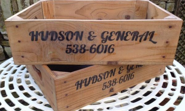
Branding is one of the most important aspects of your business, large or small. An effective brand strategy differentiates your offering from your competitors. Your brand is derived from who you are, who you want to be and how people perceive you to be. The foundation of your brand is your unique business name and logo. Your website, packaging and promotional materials, should all integrate your business name and logo to communicate your brand.

I make products which are of a vintage style and which reflect bygone years, and therefore I wanted my branding to portray an old established trading company and so derived the old sounding name Hudson & General.
The name Hudson & General came from my many visits over the years to Vancouver, Canada. Back in the 1980s and 90s there was an aviation services company called Hudson General, which operated at Vancouver Airport. With the name ‘Hudson’ being my surname it also struck a chord. So I added the ‘&’ to create an old trading company name of Hudson & General.
The crates’ stenciling also includes the number of ‘538-6016’. This number portrays an old telephone number for Hudson & General, but in actual fact the number was my house telephone number when I lived in Vancouver, Canada.

To continue the theme of an old trading company, I use vintage style fonts for my company logo and business cards. I selected Lobster font for Hudson & General, and 1942 Report font for the business cards.
The business cards are designed and printed to reflect an old ticket. I print my own cards on solid coloured card, as opposed to using a printing company. This is because printing companies use white card and print the background colour on the card, so there is always a white colour on the card edge. I wanted a solid colour to both the sides, and front and back.
I make my own parcel labels with the same font and style as the business cards, to continue the branding. All products are dispatched to customers with a parcel label tied on with natural jute twine string.


